Inference, Understanding and Action Through
Machine Learning, Statistics and Beautiful Visualizations

About Me

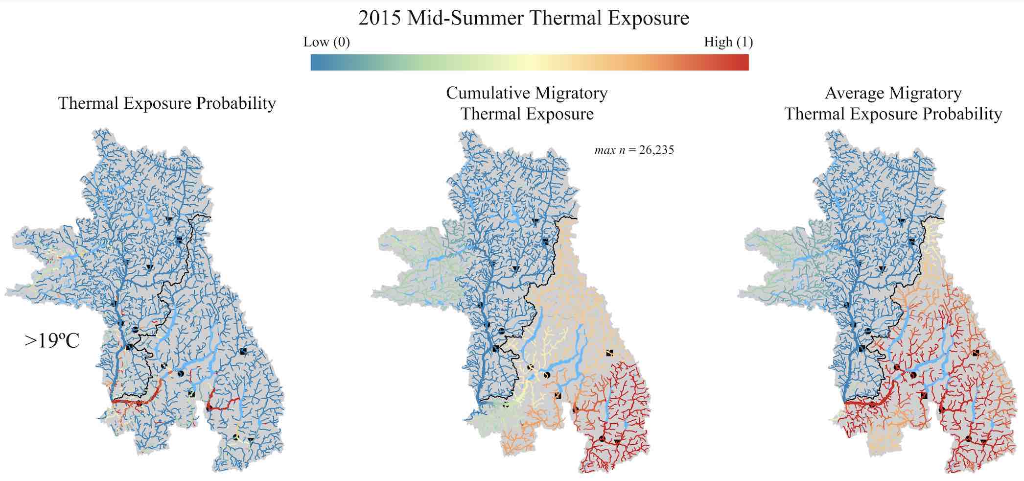
I'm a data scientist interested in exploring ideas and solving challenging problems with data. In January of 2019 I received my PhD from the Department of Biological Sciences at Simon Fraser University studying river networks and climate change. My research revealed river network structure controls patterns of climate change impacts on river ecosystems.

Working at spatial scales the size of the United Kingdom and over time periods spanning decades, I've become adept at gathering, munging and integrating high volume data of various types and building models of inferences.

I've also become keenly interested and adept at data visualization. Communicating the scope of a problem, the results of an analysis or the limitations of an algorithm is essential for maximizing the value of data. In my work I aim to build beautiful, succinct and interactive figures that encourage engagement and facilitate understanding.

Algorithmic Pareidolia Courtesy of Deep Dream Generator

Data Science Projects

Cleaning Time Series with Hidden Markov Models: Time series data is pervasive and messy. In my PhD work I collected river temperature data at two hour intervals for four years at over 100 sites resulting in nearly 2 million data points. Identifying errors in these data would be time consuming and mind numbing. Given that time series are highly autocorrelated, our expectation of any given time step is highly informed by the previous time steps.

Hidden Markov Models leverage temporal autocorrelation to not only estimate the expectation of subsequent data given previous data but also can estimate when the system has transitioned into a new state.

The figure above uses a Hidden Markov Model to separate air and water temperature observations. On the left I've plotted data for ten sites over 4 years. The yellow data are believed by the model to be in the air state while the blue data are expected water temperature observations. The right portion of the plot zooms in on one site and provides the probability estimates for each data point and the mean estimate for each temperature state.


Mapping Heat Risk: Understanding risk is a pervasive problem and requires taking uncertainty extremely seriously. In my PhD work I used river network models and time series models using MCMC and parametric bootstrapping to explore the parameter space that describes stream temperatures. In this way I could return probability estimates of exceeding any thermal threshold anywhere in the river system at any time. This process also reveals the relative contribution to risk and uncertainty in these estimate. Below are the spatial predictors of the parameter estimates that describe the temperature time series.


The Challenge of Dirty Data

Munging through buried, dirty data is a challenge. In my work studying river temperatures, the data was often literally buried, or blown on a river bank, or simply bobbing between measuring air and water temperatures with the seasons rains.

In the world of big data, finding automated ways of cleaning data will be the difference between success and failure, finding useful and actionable insights and making costly mistakes.

Mapping Space and Time: Maps make understanding space intuitive but conveying time is a bit tricky. Here placing points that describe the location and contributing area of hydro-gauge stations in the Fraser River basin is rather simple. By delineating and coloring the basin by the changing annual air temperature and precipitation we can also describe the shifting climate. This helps understand how different basins are integrating different varieties of changing climate that then impact stream flow.

A Rivers Portfolio Effect... With Certainty: Here is one simple way to describe how river networks attenuate changing flow regimes. The colored dots represent the degree of climate complexity integrated by a given catchment. The blue line is the observed attenuation and the red/yellow lines describe what we might expect if the attenuation where to occur by random chance. These random chance lines demonstrate that what we observed would be unlikely to occur randomly. Overal we show how flow trend variability decreases as watershed size and climate trend complexity increases. The pattern is rather simple but the data is rich!

Beautiful visualizations are important to understanding large and complex data.

In my work I aim to succinctly describe data in a way that is appealing to the eye, thereby engaging the audience. Engagement is the key to understanding and if the image is beautiful you can include more information without overwhelming and exhausting the viewer.

The figures found in this section are a few examples of my attempts to make simple and intuitive big ideas that leverage huge amounts of information.

Changing Climate | Shifting Water: With warming annual temperatures, places that have traditionally seen snow in the winter are increasingly shifting to rain. This change has impacts on the timing of river flow events. Visualizing these shifts are difficult in a static image but dynamic images allow us to see these changes without complex analyses or multi-panel plots. I'm interested in knowing how the network might mitigate these shifts and what the impacts may be for fish either directly or indirectly via changing phenological events or shifting temperature regimes.

Match-Mismatch: I'm currently working on a project that aims to understand phenological match-mismatch under climate change. Here I'm showing distributions of predicted estuary arrival. As the local climate of a population diverges from that of the estuary, the shape of the arrival timing distribution becomes more broad, leaving a large portion of the migration well before or after the zooplankton blooms (grey vertical lines). These new ridgeline plots sure win out over boxplots or violin plots.

Publications & Resume

My latest work considers how river networks dampen the impacts of climate change!

By integrating varied signals downstream, larger rivers average across the climate dynamics of the watershed thereby responding less dynamically to the increasing extremes of climate.

My most cited work discusses temperature thresholds when using degree-days to measure ectotherm growth. Generally we argue for a set of standardized values that facilitate cross study comparison but be careful!

Choose your threshold temperature wisely! Threshold temperatures can cause the appearance of changing growth rates with latitude or elevation.

If you are conducting a growth study over a large thermal gradient, make sure to read my other paper, "Fish Growth and Degree-Days II: Selecting a Base Temperature for an Among Population Study"

Here is my resume for a more succinct list of professional activities.

Project Notebook